Episode 183
As a Disclaimer, note that there’s no sponsor or affiliate relationship with the vendor interviewed here. They’re simply on the show to give their perspective on our topic.
As trite as it sounds, the way that we look at the world affects our understanding of it. Let me tell you about a time I noticed this. When I was a kid, I would go to school, walk into my classroom, and see my teacher there. She was such a constant there, I imagined that she never left the classroom, she was a fixture of the room, part of the furniture. It’s like the teacher didn’t persist as a person who had a life outside of the classroom. So when I was out at the grocery store with my parents and I saw my teacher, not dressed in their teacher clothes, not ensconced in their teacher setting, my brain just melted.
While this might be laughable, those of us using marketing analytics tools could be guilty of falling into the same trap. Credit for making this concept clear in not 1 but 2 great books must go to Avinash Kaushik. Think about it. According to Classic web analytics, visitors who hit our website had started an imaginary timer that we called a web session. We imagined in this race against the clock, they were viewing a sequence of pages which ferried them to forms we used as gates. We told ourselves that the gate-crossers had completed a successful session, converting from visitors into leads or customers.
Stepping back, there are a few things wrong with this picture. Users don’t only exist inside of a session, just like the teacher didn’t only exist in the classroom—they roam about as they please.
Today’s users aren’t confined to marketing content. The experience they have straddles our marketing sites, to sites and apps where their identity persists through being logged-in, where the interactions even span multiple devices – as we see on Slack and Discord for messages we’ve already read.
The user’s state changes – sometimes they complete a purchase, or become a paid subscriber, but at other times they may opt for a free plan or abandon their cart.
We need analytics for all of these actions. We need to step back and view the entire experience that people have with us over time. This is something that classic web analytics just can’t measure.
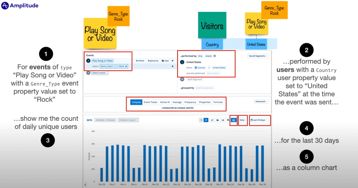
This is why the new generation of tools allows us to analyze complex trends and behavior of our users. They are collectively known as event-based analytics tools, and they excel in portraying the way that users experience a product. The foremost product-oriented analytics tool out there is called Amplitude, and today, we are speaking with its product evangelist.
Since 2021, Adam Greco has been Amplitude’s Product Evangelist, guiding clients in understanding their tool through workshops, blogs, and videos.
He got into this field in 2005 when he joined analytics platform Omniture where he was a customer advocate for four years until Adobe acquired them and rechristened them Adobe Analytics. He then worked at consultancies for 15 years, showing people how to get the most out of Adobe’s tool, authoring over 200 blog posts along the way.
Lately Adam’s speaking and advising on analytics has had him splitting his time between Chicago and Amsterdam (where he was when this was recorded). When he’s in the states and not working, he enjoys restoring and going for drives in his 62 convertible corvette.
Timestamps/Chapters
0:00 – Intro
5:00 – Meet Adam; why event-based method works better than session-based method
24:00 – PSA
24:45 – how to get value out of recent analytics tools, including warehouse-native apps
56:20 – Adam’s coordinates and free resources
People/Products/Concepts Mentioned in Show
Adam works at Amplitude
Video of Adam speaking on Warehouse-native analytics
Connect with Adam on MeasureSlack
Connect with Adam on LinkedIn